maybe any suggestion to make it better?Almaz wrote: 3f6q5p
Dude, that looks good at it is. The filter on the text is nice, and the blur on the edges is good (:Shiv wrote: 114i1o
idk why i cant make sig/banner properly :'(

maybe any suggestion to make it better?Almaz wrote: 3f6q5p
Dude, that looks good at it is. The filter on the text is nice, and the blur on the edges is good (:Shiv wrote: 114i1o
idk why i cant make sig/banner properly :'(
aaaaAAAAA \o/frightens wrote: 1v5r2d
SPOILERI made it, then made a new one lmao. I literally only used it for less than 12 hours
Overgfxed indeed.-[Jess]- wrote: 2r405h
We call this over-GFXed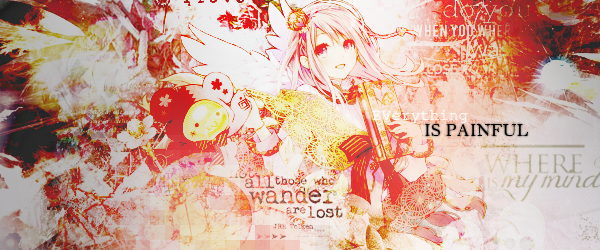
I love this commentSSShaymin wrote: 163fx
Overgfxed indeed.-[Jess]- wrote: 2r405h
We call this over-GFXed
CnC, I'm being sort of general with this and I might gloss over some thingsLet's start off with the good. The colors mesh pretty well for the most part and I like your placement of text. Your focals are also placed rather well. Probably the best of this bunch is the first piece since it has all of the things I've listed as good, plus the circle on Amatsukaze's face gives the piece a good focus on the focal.
Unfortunately, I have more problems with these pieces that I have more compliments about them. The lighting is messed up to hell and back where it's in places where it's not supposed to be. Last I checked, lights don't go into the folds of clothing or under armpits. I also mentioned earlier that one of the good things in these pieces were the colors? Yeah, it's also a weakness, but more so the coloring than the colors themselves, and combined with the textures that you've used, it makes some of them look like a mess. The worst offender of all of this is probably the last one, where it's just texture spam on top of texture spam with one color all over it (though you probably knew that already). It's just really hard to focus the focal and to be honest, it kind of hurts my eyes a little.
With that said, some advice:
- Limit your light sources to just one part of the canvas
- Rely less on coloring
- Try not to use as many textures spread across the canvas
-[Jess]- wrote: 2r405h
I love this comment
Well,I think pic4 was overspamed with texture and stuff,looking back this remind me overspamed is not good and too messy to look at,I can't find this can catch any of my eyes.i will try to redo it later.really thanks for point out of the mistake
Here: http://www.dafont.com/thinking-of-betty.fontjyling wrote: 4ecc
what font did you use ?Tae wrote: 27212k

Just deviantart. I can't seem to find the texture pack I've been using for my wip, but if you want exact places, these are the ones I've been using recently.Tae wrote: 27212k
@Reunilu your work looks really nice, keep it up! May I ask where you source your resources from?
god i love this one- K a t h - wrote: 2y3d5q
Tried experimenting with fractalssorry for the obvious mistakes here and there ;;
It's called Thinking of Betty!Shiv wrote: 114i1o
what's the font of this?
woah thanks!- Jade - wrote: 2y1f4e
It's called Thinking of Betty!
damn ur overlays teach me how to do them pleaseTae wrote: 27212k
Twitch name changes are live now, so now I have to fix everything 1000th post woo
Gracias, pero las animaciones son basicas que se sacan de photoshop, mi plan es combinar el after effects y photoshop para que quede algo asíXxCrystal wrote: 636c1j
¡Te quedaron geniales juesus, eres muy bueno con las animaciones!, pero creo que tu firma no debe resaltar tanto, intenta usar el tamaño de 13 hacia abajo.juesus wrote: 6bs6b

Don't be afraid to blur all of the background and blur the layer above the character.XxCrystal wrote: 636c1j
I've been practicing a new style to edit.
 It gives a spotlight to the main subject and that is the Character in the middle. You can double blur a subject you think is further more in the back or the opposite.
  Dank Page