OMFG. OMFG.LukaXGAMErs wrote: 1g471f
Another experiment (Song: ZICO - I am you, you are me. It's a nice song!) it might take awhile to load.. and I can't use this sig because it has too many frames T^T
forum
Post your GFX! 4jj
posted
Total Posts
399
ahaha thanks to you sensei!! huehuehuehuehue HUEHUEHUE GWAPO NIYA DBA???( ͡° ͜ʖ ͡°)- K a t h - wrote: 2y3d5q
OMFG. OMFG.LukaXGAMErs wrote: 1g471f
Another experiment (Song: ZICO - I am you, you are me. It's a nice song!) it might take awhile to load.. and I can't use this sig because it has too many frames T^T
wips...?
SPOILER

This is better than five rounds of background building... right? Also tried working with gifs after almost a year. This was just a small trial to see how much my gif making skills have rusted before I flubb up on actual sigs. Sorry to anyone I've offended by making these.


This is better than five rounds of background building... right? Also tried working with gifs after almost a year. This was just a small trial to see how much my gif making skills have rusted before I flubb up on actual sigs. Sorry to anyone I've offended by making these.
whoa that perfect :3SSShaymin wrote: 163fx
wips...?
SPOILER
This is better than five rounds of background building... right? Also tried working with gifs after almost a year. This was just a small trial to see how much my gif making skills have rusted before I flubb up on actual sigs. Sorry to anyone I've offended by making these.
i want add animated thing to in my avatar but that make it quality drop,and i must reduce it size max 88kb -_-
Nah, the sig where it is at the moment is far from perfect. It still has a ways to go before I think I'm really done with it (although apparently my background building says otherwise). But thank you anyway. : >Wall-ed wrote: y4g5f
whoa that perfect :3
i want add animated thing to in my avatar but that make it quality drop,and i must reduce it size max 88kb -_-
And yeah, I know that feel with max sizes. I really don't like dealing with them either.
-Rikushi
Kyaaa that's pretty Nila~ >//<Nila-chan wrote: 67442r
Interesting!Nila-chan wrote: 67442r
Also my new signature below ^^
- K a t h - wrote: 2y3d5q
Kyaaa that's pretty Nila~ >//<Nila-chan wrote: 67442r
thanks c:Shizuku- wrote: 6j4vc
Interesting!Nila-chan wrote: 67442r
Thank you! Also yeah, I have the 128 versions of these avatars, I just wanted to post these so the details are much clearer! ^-^SSShaymin wrote: 163fx
Ah man, these look nice! This is a good start, but you might wanna downsize your avatars a bit more. Actually the size for these avatars are fine, it's just that avatars are supposed to be small. Keep that in mind.Luxikuma wrote: 6d6z60
still kinda new so i started on avatars :3

waaahhhhhh jlzjzoijfs *drools*Wall-ed wrote: y4g5f
forget to add camera effect -_-
That's incredible
i still can't use PS well 
so i make an avatar with corelDraw, am i the only one ?
this is one of my avatar that i ever create
so i make an avatar with corelDraw, am i the only one ?
this is one of my avatar that i ever create
huge images, sorry ><"

 (don't mind the watermark it was on my personal profolio/old website ;w;)

..! Your avatars are really cute, especially your text! You won't get much of anywhere just blurring pictures, though. Try practicing renders on smaller canvas like 350 x 150 and go from there. I can't work with plain old images myself, but that doesn't mean I can't try. All it takes it practice. And a bit of resource hunting and finding tutorials. Those too.Shiv wrote: 114i1o
idk if this counted as GFX too ;-;, im just making this to fill my time
banner
srsly i dont know how to make effect properly ;w;
if someone can teach me, i'd be grateful
i cant deal with big canvas and rendered image, so i cant make a wallpaper properly ;w;
!!! Okay, your first piece is probably your best one of the bunch. The lighting is good (for what little it's supposed to be, anyway), the flow is lovely, and your text doesn't stand out so much that it draws away from the focal, yet stands out on its own. It suffers from a lack of color and depth, though.Deadly wrote: 4a3q1c
probably my proudest things i've made so far heH....
huge images, sorry ><"
Your third piece, though... eh. There are so many lighting effects to the point that it's extremely busy and I can't tell where I'm supposed to look on the piece. I end up looking at the right of the piece. On top of that, the lighting doesn't match up too well with the focal. It's a little disorienting, to say the least. That doesn't mean I don't hate everything about this piece, though. I think the flow is nice and I love your usage of text (the subtext could use some work, though. It doesn't fit too well).
Thank you for the advice.SSShaymin wrote: 163fx
..! Your avatars are really cute, especially your text! You won't get much of anywhere just blurring pictures, though. Try practicing renders on smaller canvas like 350 x 150 and go from there. I can't work with plain old images myself, but that doesn't mean I can't try. All it takes it practice. And a bit of resource hunting and finding tutorials. Those too.
I hope i can be better at this thing someday.
both of them looks cool xDAlmaz wrote: 3f6q5p
Did a new header-thingy for my GFX thread today, and I'm pretty proud of it ^^
Raisha Millenia wrote: 6r2v16
Imo the text is just a little bit light and blends with the image a bit too much, but it still looks nice nonetheless. Better than my first signature xD
im using stroke options on the shape selectionAlmaz wrote: 3f6q5p
Looks good! How do you do the border on that?Shiv wrote: 114i1o
Hey, i made a new banner for my friend. Let me know your opinion guys 
Ahh, I don't think I have that in my photoshop (CS2 ahaha)Shiv wrote: 114i1o
im using stroke options on the shape selection
Also, new avatar (Trying new things ^^)
I guess it's mostly Layouts.
Dark Purple Rose
Mami Tomoe
Layout for some person I made (1)
Layout for some person I made (2)
Dark Purple Rose
Mami Tomoe
Layout for some person I made (1)
Layout for some person I made (2)
I made this yesterday, plan to get streaming some time soon. Feel free to tell me what you think, and how I can improve ^^
Almaz wrote: 3f6q5p
I made this yesterday, plan to get streaming some time soon. Feel free to tell me what you think, and how I can improve ^^
Assuming this is an Osu! stream.
I think the background could be animated if you got the skill to do so. If there's one thing I've learned from Osu! streams is that every single one of them is the same in of an overlay. Kutsuu is pretty much the only one who has a moving one and to me that's eye candy. Other than that it's a very nice and smooth overlay.
Thank you for your input!ReachingHavoc wrote: 661959
Assuming this is an Osu! stream.
I think the background could be animated if you got the skill to do so. If there's one thing I've learned from Osu! streams is that every single one of them is the same in of an overlay. Kutsuu is pretty much the only one who has a moving one and to me that's eye candy. Other than that it's a very nice and smooth overlay.
As much as I'd like to do animation, my PC is not currently in a state in which I can do such things. However, I'll take it into mind and see what I can do when I get an upgrade in the future.
hmm idk if it gfx or not,because i am not drawing it :3
if i wrong to puttin in here i am sorry for that : )
if i wrong to puttin in here i am sorry for that : )
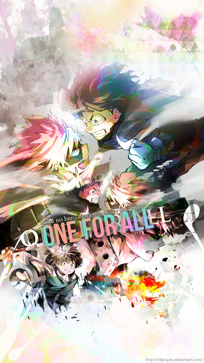
Made a bunch of phone wallpapers in between doing page graphics, really like how some of them turned out :3
If any of you need GFX done, don't hesitate to ask
If any of you need GFX done, don't hesitate to ask
It's supposed to be a profile banner for my on another game. But apparently it has a restraining profile layout size, so I can't make use of the buttons.
But I can finally put .gif images into GFX. I feel accomplished.
Been practicin' some more and just wondering what can be improved and whether I can collab at this point or still keep working cx
This is cool (⊙▽⊙)7RynaHitsune wrote: 712b62
It's supposed to be a profile banner for my on another game. But apparently it has a restraining profile layout size, so I can't make use of the buttons.
But I can finally put .gif images into GFX. I feel accomplished.
How do I make my banners less ugly? Any suggestions welcome.-ryusakihatsue- wrote: 5f4l55
others giving constructive criticism so they can learn
Your text doesn't really fit the image well at the moment, due to the outer glow and the text colour clashing, which makes it less appealing, in my opinion. Try experimenting and see what looks good. (:Jonawaga wrote: 5583x
How do I make my banners less ugly? Any suggestions welcome.
I hope I don't offend you by saying this aaaa
Thanks for the help. <3Almaz wrote: 3f6q5p
Your text doesn't really fit the image well at the moment, due to the outer glow and the text colour clashing, which makes it less appealing, in my opinion. Try experimenting and see what looks good. (:Jonawaga wrote: 5583x
How do I make my banners less ugly? Any suggestions welcome.
I hope I don't offend you by saying this aaaa
-ryusakihatsue- wrote: 5f4l55
others giving constructive criticism so they can learn
Dude, that looks good at it is. The filter on the text is nice, and the blur on the edges is good (:Shiv wrote: 114i1o
idk why i cant make sig/banner properly :'(
maybe any suggestion to make it better?Almaz wrote: 3f6q5p
Dude, that looks good at it is. The filter on the text is nice, and the blur on the edges is good (:Shiv wrote: 114i1o
idk why i cant make sig/banner properly :'(
SPOILER
I made it, then made a new one lmao. I literally only used it for less than 12 hours


aaaaAAAAA \o/frightens wrote: 1v5r2d
SPOILERI made it, then made a new one lmao. I literally only used it for less than 12 hours

Gosh, I'm tired. But I need to do something with GFX today. wip for another forum.

Overgfxed indeed.-[Jess]- wrote: 2r405h
We call this over-GFXed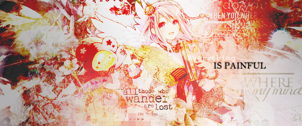
CnC, I'm being sort of general with this and I might gloss over some things
Let's start off with the good. The colors mesh pretty well for the most part and I like your placement of text. Your focals are also placed rather well. Probably the best of this bunch is the first piece since it has all of the things I've listed as good, plus the circle on Amatsukaze's face gives the piece a good focus on the focal.
Unfortunately, I have more problems with these pieces that I have more compliments about them. The lighting is messed up to hell and back where it's in places where it's not supposed to be. Last I checked, lights don't go into the folds of clothing or under armpits. I also mentioned earlier that one of the good things in these pieces were the colors? Yeah, it's also a weakness, but more so the coloring than the colors themselves, and combined with the textures that you've used, it makes some of them look like a mess. The worst offender of all of this is probably the last one, where it's just texture spam on top of texture spam with one color all over it (though you probably knew that already). It's just really hard to focus the focal and to be honest, it kind of hurts my eyes a little.
With that said, some advice:
- Limit your light sources to just one part of the canvas
- Rely less on coloring
- Try not to use as many textures spread across the canvas
I love this commentSSShaymin wrote: 163fx
Overgfxed indeed.-[Jess]- wrote: 2r405h
We call this over-GFXed
CnC, I'm being sort of general with this and I might gloss over some thingsLet's start off with the good. The colors mesh pretty well for the most part and I like your placement of text. Your focals are also placed rather well. Probably the best of this bunch is the first piece since it has all of the things I've listed as good, plus the circle on Amatsukaze's face gives the piece a good focus on the focal.
Unfortunately, I have more problems with these pieces that I have more compliments about them. The lighting is messed up to hell and back where it's in places where it's not supposed to be. Last I checked, lights don't go into the folds of clothing or under armpits. I also mentioned earlier that one of the good things in these pieces were the colors? Yeah, it's also a weakness, but more so the coloring than the colors themselves, and combined with the textures that you've used, it makes some of them look like a mess. The worst offender of all of this is probably the last one, where it's just texture spam on top of texture spam with one color all over it (though you probably knew that already). It's just really hard to focus the focal and to be honest, it kind of hurts my eyes a little.
With that said, some advice:
- Limit your light sources to just one part of the canvas
- Rely less on coloring
- Try not to use as many textures spread across the canvas
Well,I think pic4 was overspamed with texture and stuff,looking back this remind me overspamed is not good and too messy to look at,I can't find this can catch any of my eyes.i will try to redo it later.really thanks for point out of the mistake
constructive criticism is appreciated
i guess i didnt post this here before xd
i guess i didnt post this here before xd
-[Jess]- wrote: 2r405h
I love this comment
Well,I think pic4 was overspamed with texture and stuff,looking back this remind me overspamed is not good and too messy to look at,I can't find this can catch any of my eyes.i will try to redo it later.really thanks for point out of the mistake
oops, had to try again
but something is off and idk what :/
(Im not copying Leafy i just like the style f f s)
but something is off and idk what :/
(Im not copying Leafy i just like the style f f s)
My first GFX edit ( i Think ? )
Using link because image not loaded properly xd http://puu.sh/rACN0/53c2c88264.png
Jijou